Charts and time ranges
 9:41192.168.1.107
What it shows
In One per screen, the lower part of a coin’s screen is a line of its price over a time range, named in a corner: 24h, 48h, 7d, 14d, 30d, 60d or 90d. All ranges count back from now.
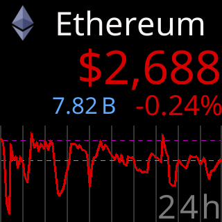
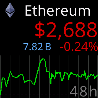
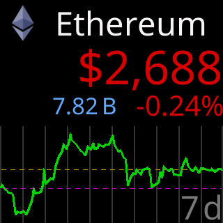
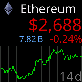
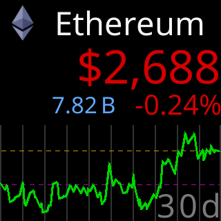
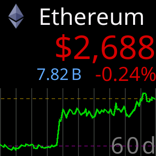
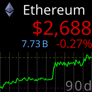
The line is drawn in the colorset’s up color when the latest price is above where the range began and the down color when it is below; in the Colorblind set that is blue and yellow. A line whose two ends sit level is drawn in a neutral gray, because it went neither way. The newest price is drawn live at the right end, so the end of the line is always now.
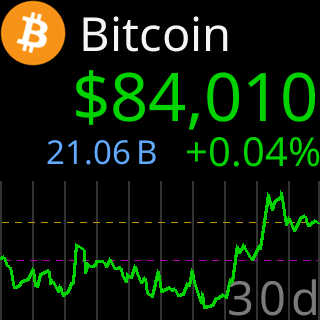
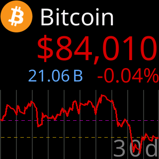
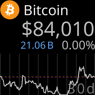
With several ranges selected, the coin plays a chart for each, shortest first, and its Show Coin for: time is split evenly across them. With none selected, the same space shows the coin’s percentage change over 7d, 30d and 90d in three rows, and 24h as a fourth row when the stats row is off.
A range the server has no data for shows an empty frame with (No 7d Data); see The chart shows (No Data).
Options
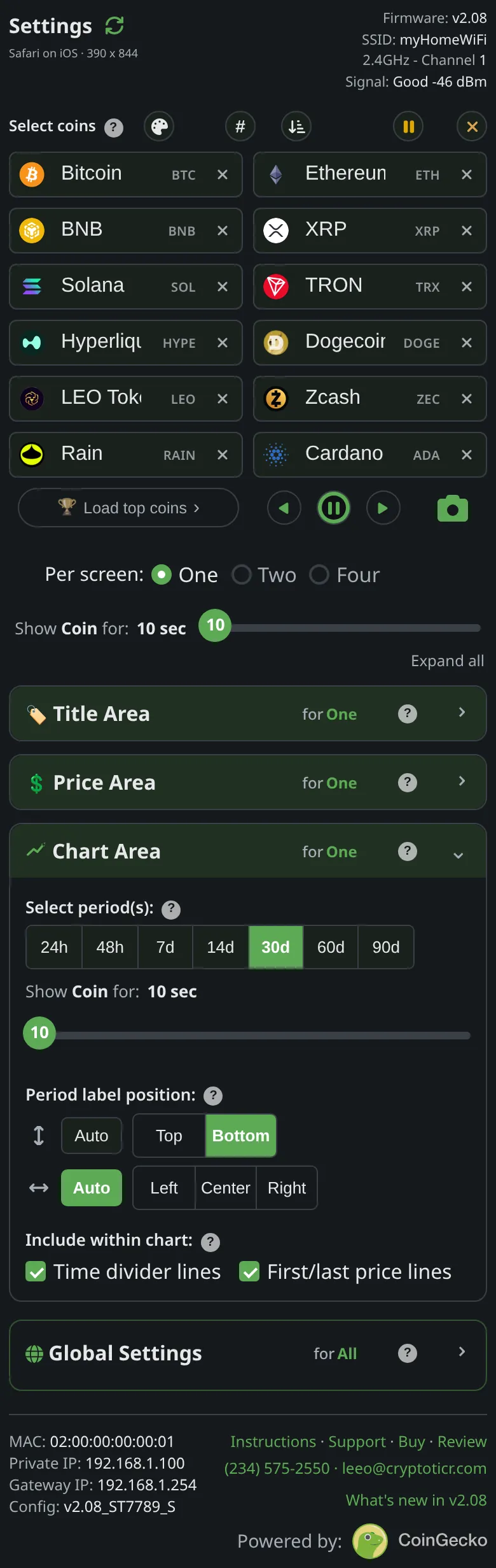
Select period(s):seven buttons, any number of them.- Where the range’s name sits: Chart period label position.
- Faint helper lines inside the chart: Chart lines.
- How long each chart stays: the
Show Coin for:slider; see How long each screen stays. - Charts exist in One per screen only:
Two and Four per screen modes have no chart.
Where to set it
Display → Chart Area → Select period(s):. Applies at once. Reference: Setting: chart time ranges.