Display options
One coin per screen
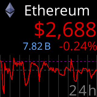
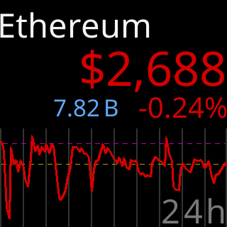
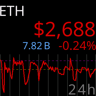
The whole screen for one coin at a time: its name across the top, its price in the middle, a chart along the bottom.
Title Area
Identify each coin your way
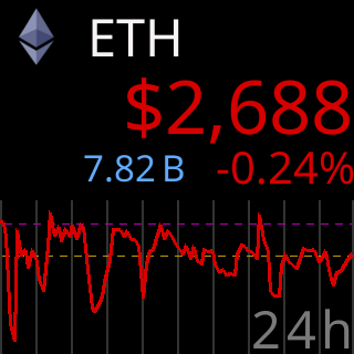
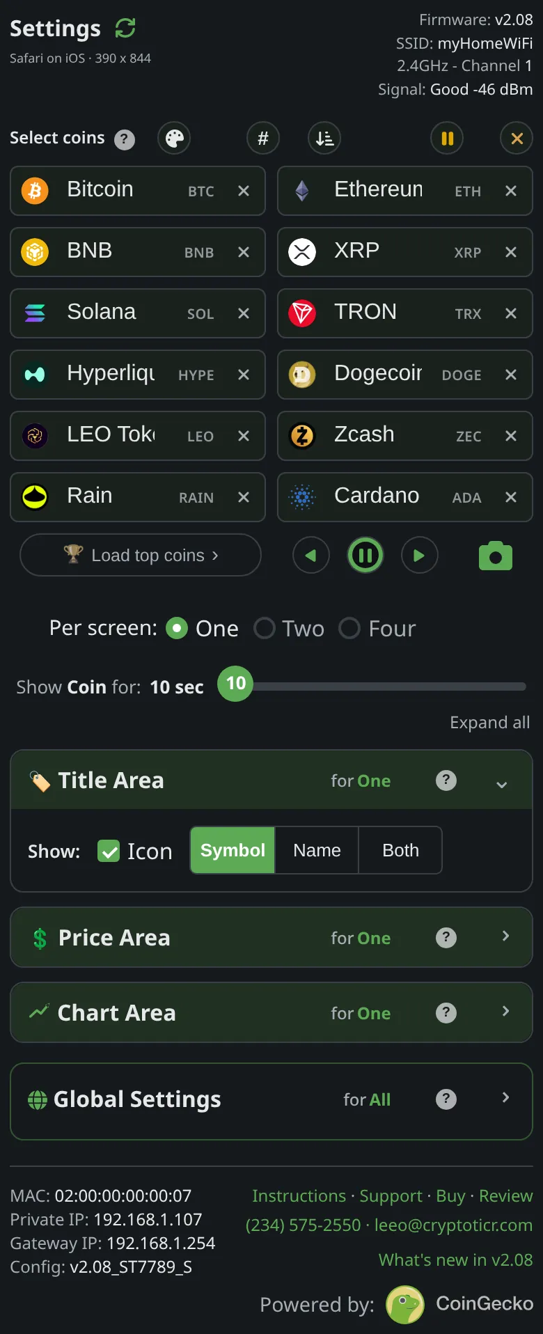
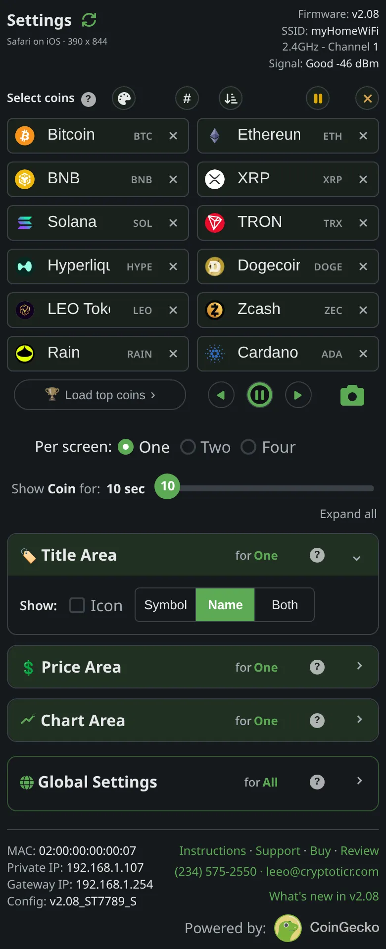
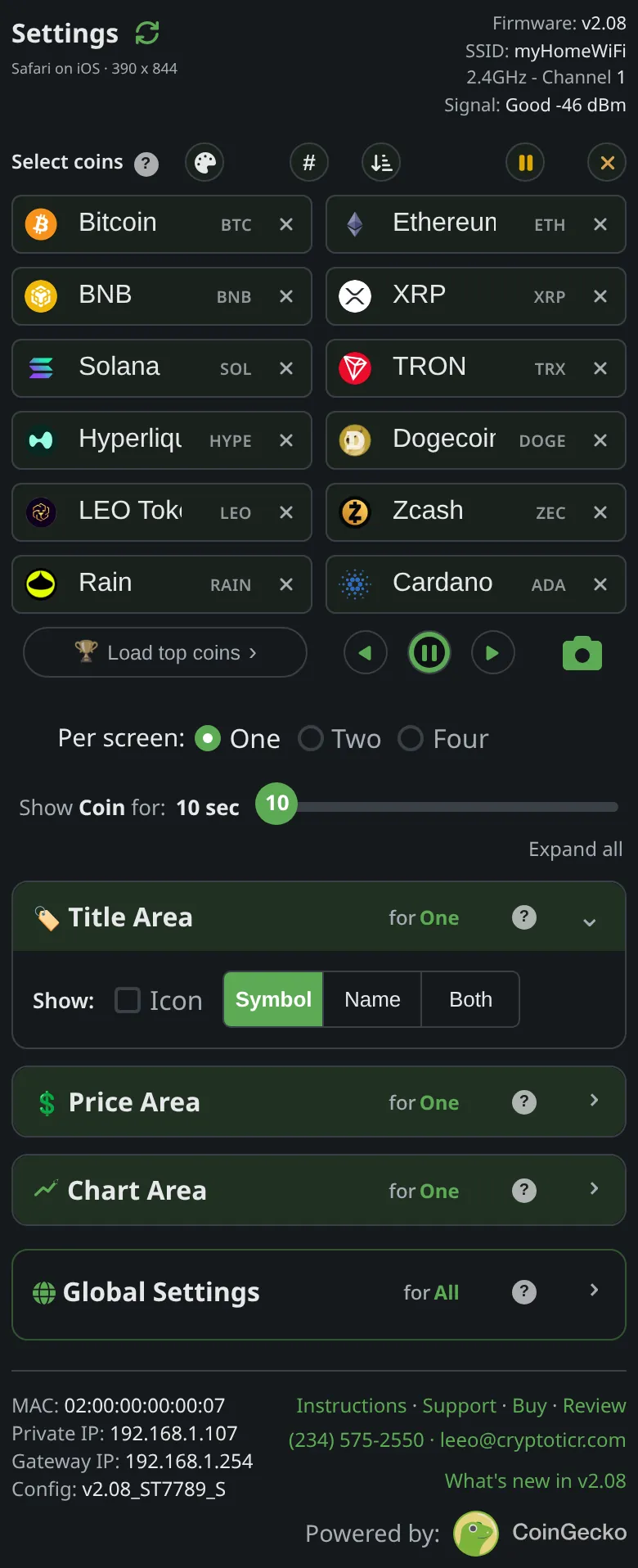
Top row: the coin's icon, its symbol, its name, or a mix. Both puts the symbol first and the name beside it, never larger.
Give me the full detailsHide the details
What can the Title Area show on a one-coin screen?
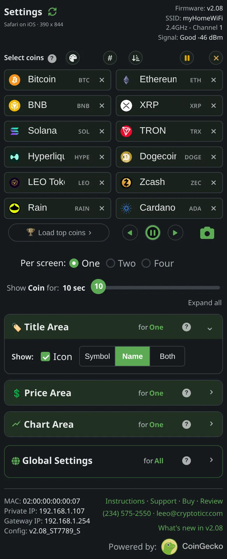
On this screen the Title Area draws one of five combinations: icon and name, icon and symbol, symbol and name together, name only, or symbol only. You build it on the settings page from an Icon checkbox and a three-way choice after “Show:”: “Symbol”, “Name” or “Both”. The factory setting is the icon with the name. The choice is remembered for One per screen alone, which is what the “for One” tag beside the section heading means, so Two and Four per screen can keep a different title.
- Icon with a name or a symbol: the coin's logo sits at the left edge, 47 pixels square, and the text starts a short gap after it, centered on the logo's middle.
- “Both” without the icon: the symbol in the largest title size, then the name beside it, as large as the remaining width allows but never larger than the symbol, sharing the symbol's bottom line. A short name can match the symbol's size; a long one comes out smaller.
- Name only or symbol only: the text alone, starting at the left edge and centered in the height of the title band.
The title is drawn in the colorset's title color (near-white in the Default colorset) and never changes with the market. The up and down colors belong to the price and the chart.
How does the ticker fit a long coin name?
The ticker tries the title in seven type sizes, largest first, and uses the first size that fits the width left beside the icon, or the full width when there is no icon. The smallest of the seven is about half the height of the largest, so most names fit whole. Only when even the smallest size is too wide does the ticker cut letters off the end, one at a time, until the rest fits. There is no ellipsis. The fit is worked out again for every coin as it comes up, so a short name sits in large type while a long one steps down, coin by coin.
With “Both”, the symbol keeps the largest size and only the name gives way: it steps down in the space left after the symbol, and it is never drawn taller than the symbol beside it.
What happens when a coin's name is the same as its symbol?
The ticker shows a name that matches its symbol only once. Before it draws a symbol and a name together, it compares the symbol with the name written in capitals, and when they match it draws the symbol alone. XRP, whose name and symbol are both “XRP”, reads “XRP”, never “XRP XRP”. The same check applies when the symbol and name stand in for a missing icon. The other combinations show a single text anyway, so they need no check.
What does the title show for a coin with no icon?
In either icon combination, a coin the ticker has no icon for is titled with its symbol and name side by side, in one type size, starting at the left edge where the icon would have been. The name-only and symbol-only titles look the same with or without an icon.
The icons live on the ticker itself. They are stored as one pack of coin artwork beside the firmware, and each icon is found by the coin's own identity rather than its symbol, so two coins that share a symbol still get their own logos. Nothing is downloaded when a coin comes up. A coin missing from the pack, usually a new listing or one that was not among the top coins when the pack was made, keeps its symbol and name in the icon's place. A new pack reaches the ticker by itself with its automatic updates, with a “New artwork” card and one restart, so there is nothing to do, and if the pack is ever missing or damaged, the ticker fetches a fresh copy on its own; every icon title shows symbol and name until it arrives. If a missing logo matters to you, get in touch. More in icon updates and coins show no icon.
In the Amber and Green colorsets the icons are drawn in the set's own single color, like the screen of an old monochrome monitor, so a colorful logo never breaks the look.
Why can't the title show the icon with both the symbol and the name?
The ticker's screen is 240 pixels wide, and the icon, a gap, the symbol at full size, another gap and a readable name do not fit across it, so the settings page does not let you choose all three. It keeps your latest pick, drops the other, and says which it did:
- Tap “Both” while Icon is ticked: “Both” stays and the icon is switched off, with the note “Icon+Both won't fit, deselecting Icon”.
- Tick Icon while “Both” is selected: the icon stays and the text changes to “Name”, with the note “Icon+Both won't fit, selecting Name”.
The note stays up for four seconds while the control being dropped blinks, so you can see what moved. If that combination ever reaches the ticker's settings anyway, the ticker draws the icon with the name. See also why it says Icon+Both won't fit.
What happens to coin names in other alphabets or with accents?
The ticker's type draws unaccented letters, digits and ordinary punctuation, so accented letters and other scripts are removed from a name or symbol before it is drawn. Four marks are drawn as stand-ins: \ as /, ^ as ', { as ( and } as ). If a name loses every character, the symbol stands in for it, and the other way round. If both come up empty, the ticker shows the coin's icon, even with a name-only or symbol-only title, because the logo identifies the coin better than anything left of its text. With no icon either, it prints the coin's plain-letter identifier rather than a row of empty boxes.
How do I tell apart two coins that share a symbol?
Two coins that share a symbol are told apart by adding the icon or the name to the title. Symbols are not unique, and with a symbol-only title two different coins with the same symbol would look identical, so the Title Area warns you when your list holds such a pair: “with Symbol only they'll look identical. Add Icon to tell them apart.” Icons are matched to the coin itself rather than its symbol, so each coin shows its own. See coins that share a symbol.
Price Area
The price, and your choice of market data

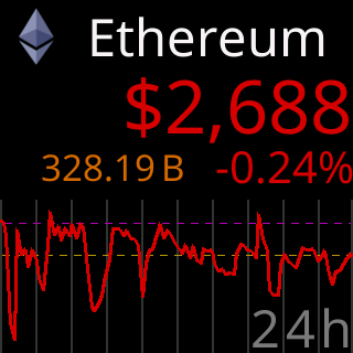
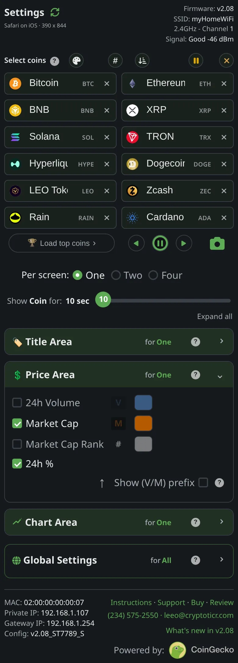
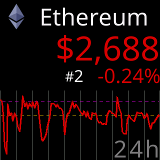
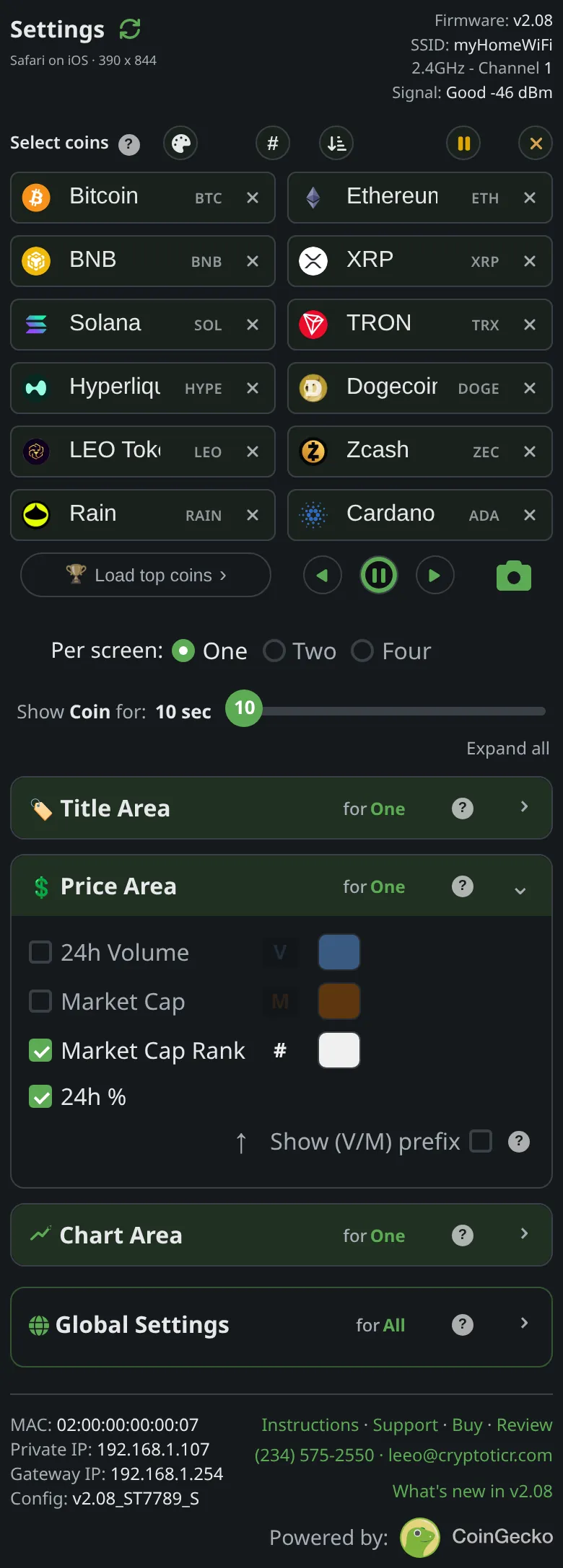
The price in the middle, colored by its last 24 hours. Under it, the 24h% on the right, and 24h Vol, market cap or rank on the left.
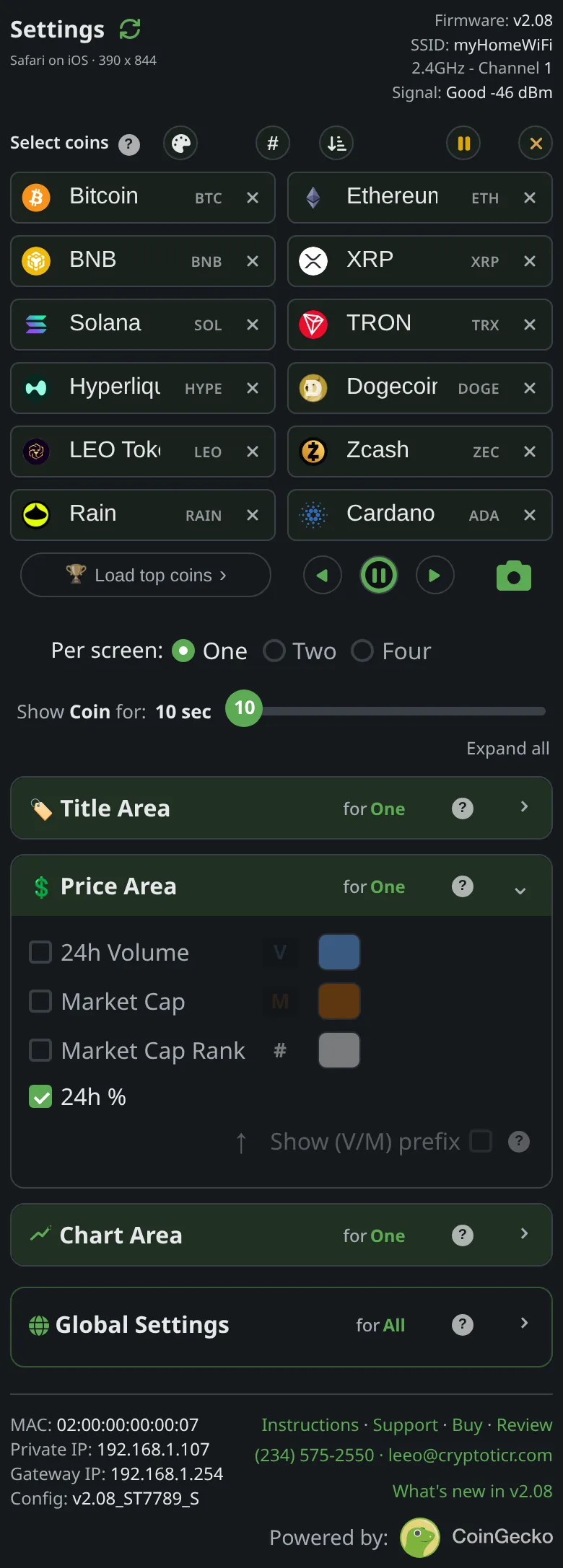
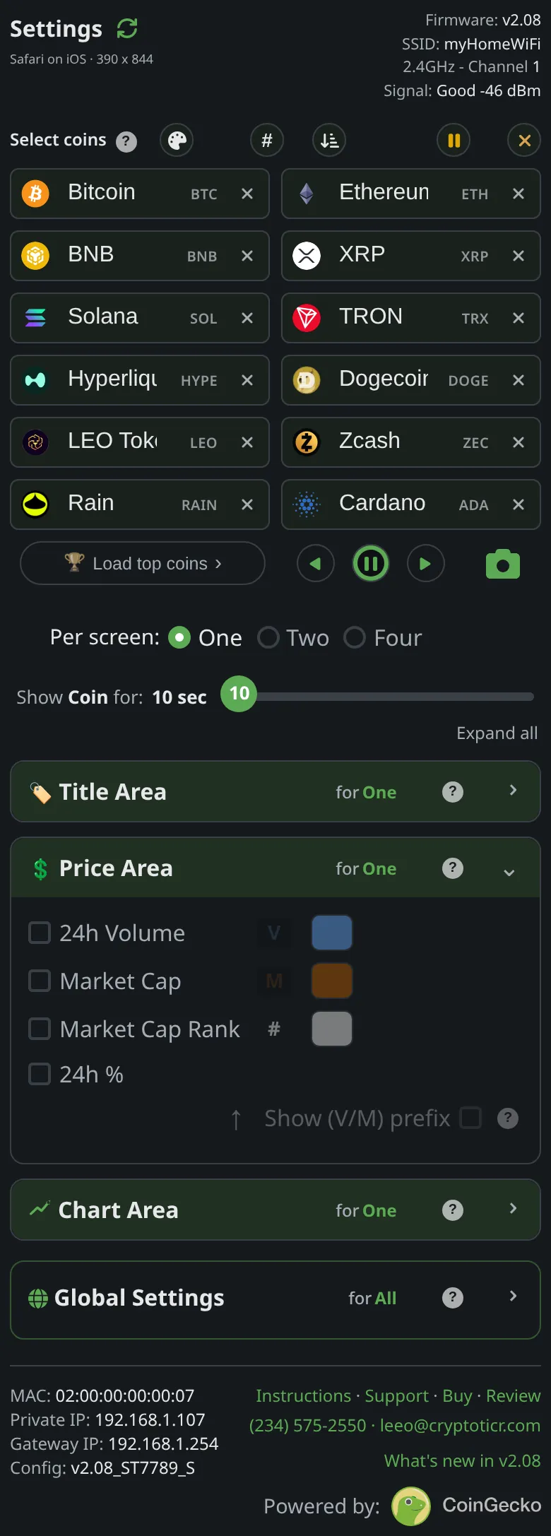
Give me the full detailsHide the details
How does the ticker write a price?
The ticker writes every price in US dollars, with a “$” in front, commas between thousands and a dot before the cents. How many digits follow the dot depends on the size of the price:
- $1,000 and above: whole dollars, as in $64,231.
- From $1 up to $999.99: two decimals, as in $3.42 or $542.10.
- Under $1: four significant digits, counted from the first digit that is not zero, as in $0.4321 or $0.01234. Trailing zeros are dropped, but never below two decimals, so half a dollar reads $0.50.
- Under $0.0001: a shorthand for the zeros, described in the next answer.
The price is drawn in the largest type that fits across the screen, set against the right edge. The two largest sizes each come in a regular and a narrower cut, and the ticker tries both before stepping down a size, so a short price gets the largest type and a long one steps down only as far as it must. Its color is the coin's direction over the last 24 hours (see up and down colors). Prices are always in dollars; see other currencies.
How are very small prices shown?
A price under one hundredth of a cent ($0.0001) is written as “$0.0”, then a small number counting the zeros after the decimal point, then the first four significant digits. So $0.00001234 appears as $0.0₄1234: four zeros, then 1234. Trailing zeros among the four digits are dropped, and the small count sits on the digits' bottom line in a smaller size. The shorthand keeps a tiny price short enough to stay in large type, where a long run of zeros would force it down to a small one.
What is the 24h% figure?
The 24h% is the coin's price change over the last 24 hours as CoinGecko reports it, and it is rolling: it compares the latest price with the price 24 hours before it, never with midnight. The ticker writes it with two decimals and a sign, as in “+2.35%” or “-0.47%”. A change that rounds to 0.00% carries no sign and is drawn in neutral gray. When CoinGecko has no 24h figure for a coin, which happens with some thin or newly listed markets, the 24h% reads “-.--%” and the price is gray: a missing figure is never printed as a 0.00% nobody measured. Otherwise it always wears the colorset's up or down color, so its color and its sign agree, and it cannot be recolored. It keeps a fixed place at the right end of the row under the price, in the row's larger size, and it never moves or flickers while the figures beside it take turns. See why 24h and not since midnight.
What do 24h Vol, Market Cap and Market Cap Rank mean?
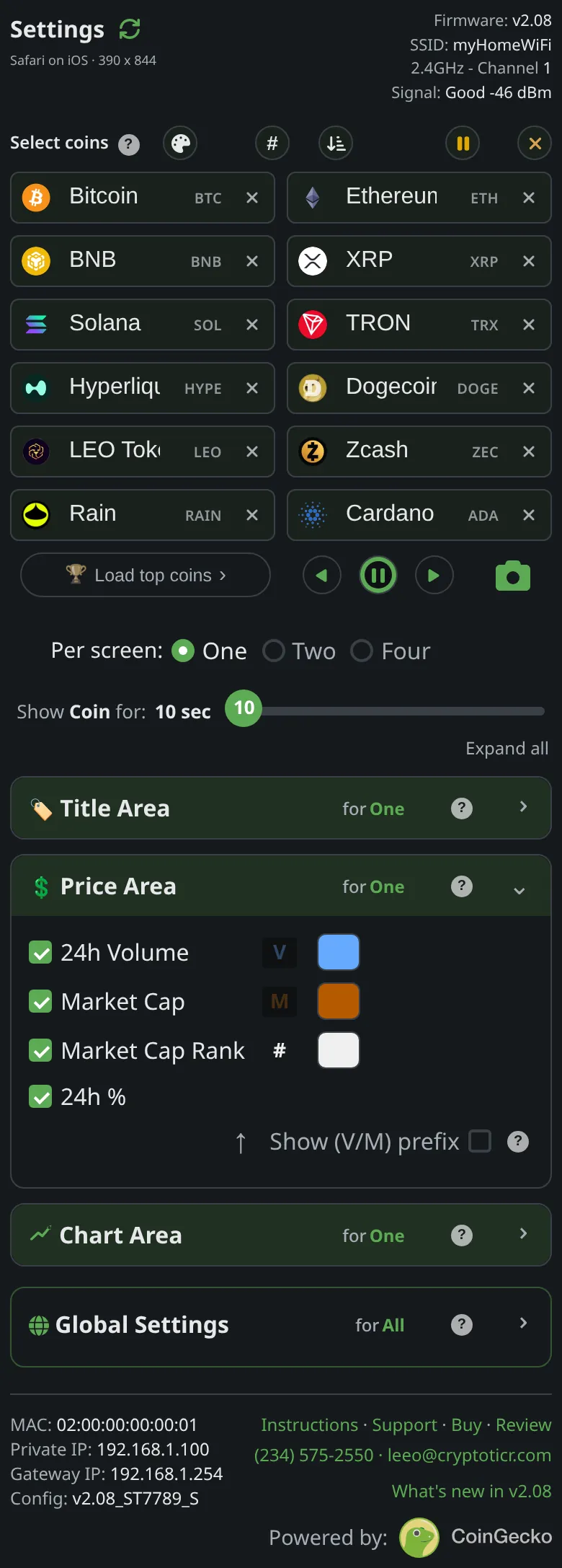
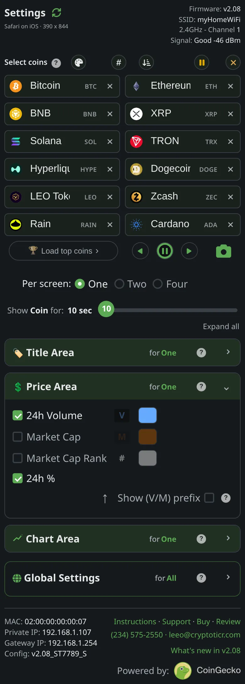
The 24h Vol, Market Cap and Market Cap Rank figures share the left side of the row under the price, each in its own color:
- 24h Vol: the value of the coin traded in the last 24 hours across the exchanges CoinGecko tracks, in US dollars.
- Market Cap: the coin's market value, its price times the coins in circulation.
- Market Cap Rank: the coin's place among all coins by market cap, #1 being the largest, written as “#7”. It comes with each fetch; when a fetch carries none, the ticker falls back to an earlier rank for that coin.
Volume and market cap are in dollars but drawn without the “$”. Millions, billions and trillions are shortened to M, B and T with two decimals and a narrow space, so “1.73 B” means $1.73 billion and “2.41 T” means $2.41 trillion. Figures from 1,000 up to a million are whole numbers with commas, and smaller ones carry two decimals. A figure the source does not have reads “No VOL”, “No MC” or “No RNK”. The figure is drawn one size smaller than the 24h% and steps down up to two more sizes if it is too wide. With the 24h% switched off, the figure moves to the right edge and takes the larger size itself.
How do several ticked figures take turns?
Several ticked figures share one spot and split the coin's whole stay evenly. Whatever order you ticked them in, the order on screen is always 24h Vol, then Market Cap, then Market Cap Rank. Each gets an equal share of the coin's Show Coin for time: all of it with one ticked, half each with two, a third each with three. The share is of the whole stay, not of each chart, so the figures keep their own rhythm while the charts below change. From the factory 24h Vol and Market Cap are ticked, so each shows for half of the coin's 10 seconds. At each turn only the figure's spot is redrawn; the price and the 24h% stay still.
What does the V/M prefix do?
Show (V/M) prefix puts a small “V” in front of the volume and an “M” in front of the market cap, two sizes smaller than the figure and in its color, so you can tell the two apart without knowing which color means which. Rank needs no letter, because it always wears its “#”. The setting is saved per colorset: it is on from the factory in Amber and Green, whose figure colors sit close together, and off in the others. The checkbox only works while at least one of the three figures is ticked. One of the moving tiles above has it on.
Can I recolor volume, market cap and rank?
Yes: volume, market cap and rank each have their own color swatch beside their checkbox. Tap one for a color picker (a shade square, a hue slider and a hex box), and the ticker shows the new color at once. The choice is saved per colorset: recolor volume in Default, switch to Neon and you get Neon's own volume color, switch back and your Default choice returns. A “Default” button appears beside an edited color to put back that colorset's own. The picker will not go darker than about 40% brightness, so a figure cannot vanish into the black screen. The 24h% cannot be recolored, because its color is its direction. In the Default colorset, volume is light blue, market cap orange and rank near-white. See custom colors.
How often do the price and figures refresh?
The ticker refreshes a coin's price and figures every time the coin comes up. As a coin's turn begins, the ticker fetches its latest price, figures and charts. It holds those numbers for the whole stay; nothing is fetched again midway, and the turns of the figures and the charts all come from that one fetch. With several coins in your list, each coin's figures are as fresh as the start of its latest turn. With one coin, the ticker fetches again at every stay, every 10 to 30 seconds depending on Show Coin for. Each fetch starts about half a second before the previous stay ends, so the next coin still gets its full time. All figures come from CoinGecko. See how often prices refresh.
What does the screen show when data is missing or old?
When one coin's fetch fails, the ticker does not leave an old price standing: the price becomes a large dim “-.--” with a one-line reason under it in small type, such as “No reply”, or “Reply cut off” when the link dropped partway through the answer, and the row of figures is cleared. A price of zero is always treated as missing, never shown as a price. That coin stays up only briefly, about a second and a half, its charts are skipped for that turn, and the rotation moves on; the coin's next turn tries again.
When the ticker cannot reach its data at all, it stops the rotation and keeps the last good screen up, so the figures you see are the last ones it fetched. While it keeps trying, small “Retry 1 of 3” notes appear over the chart, and every few tries a box headed “I can't see my server” says how long ago the data was last fine and counts down to the next try, as in “Trying again in ~9s”. The ticker retries every 8 to 11 seconds and picks up with fresh figures as soon as an answer comes back. See I can't see my server and prices stopped updating.
Chart Area
A chart for each period you choose


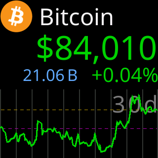
The bottom of the screen is a price chart, and the right end of its line is always now.
Chart period
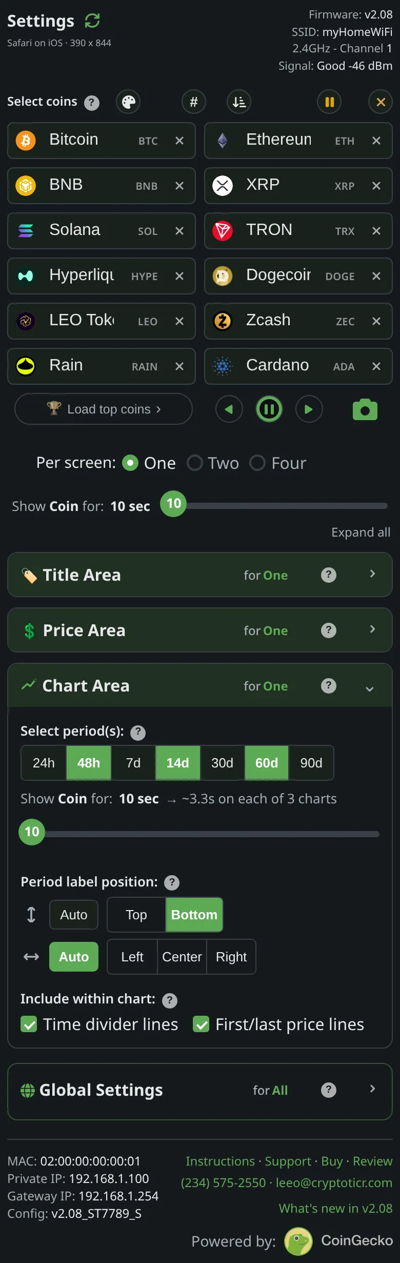
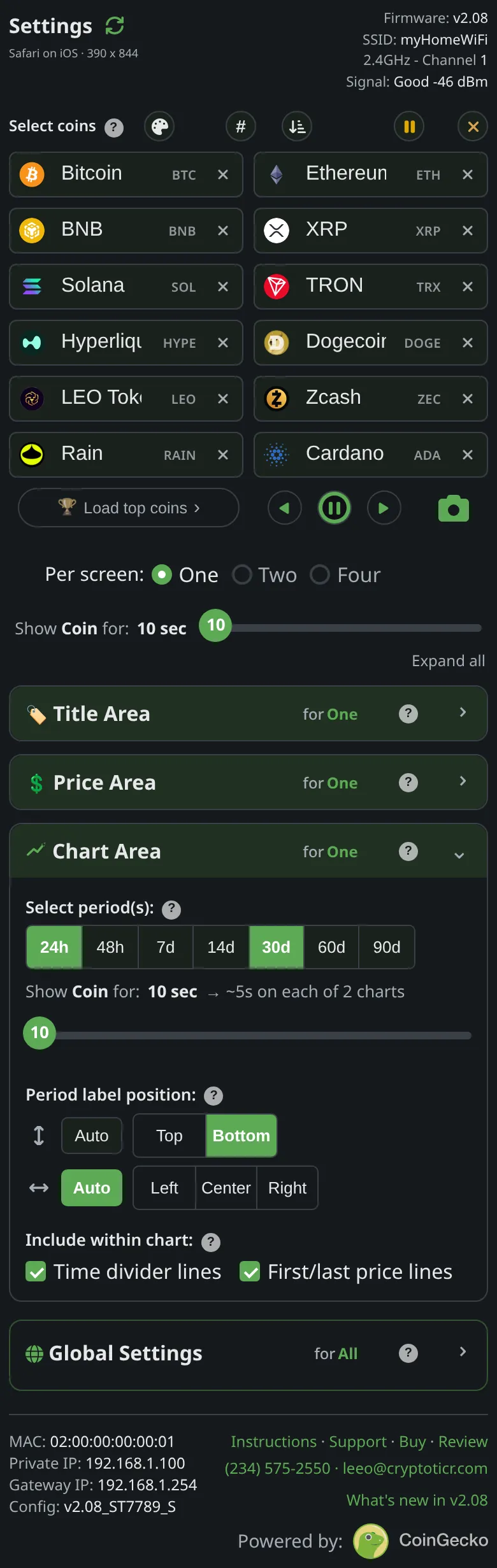
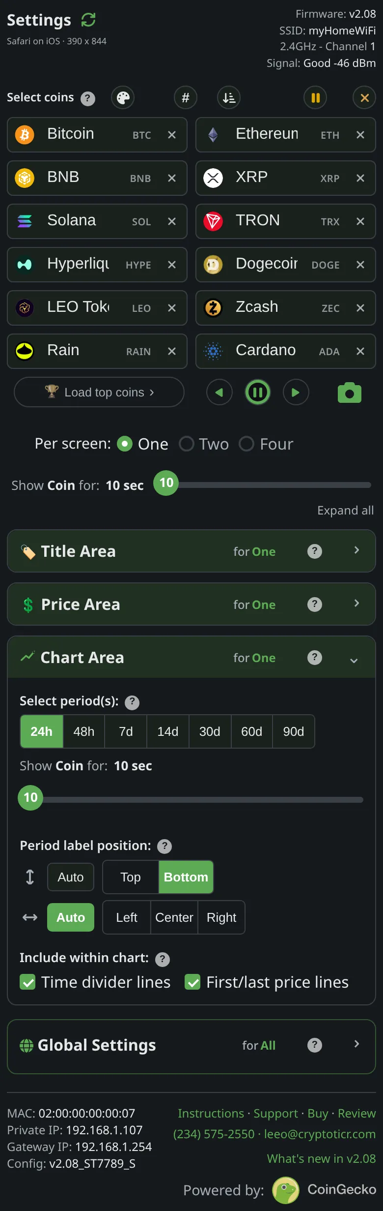
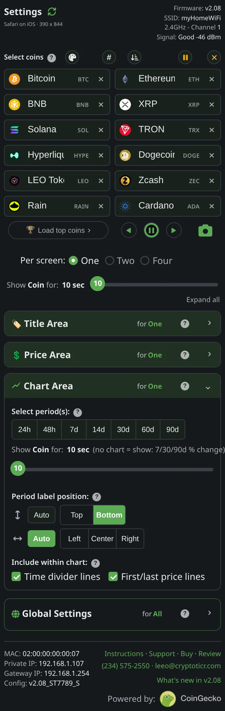
The bottom of the screen is a price chart. Enable several periods and the coin plays one after another.
The lines
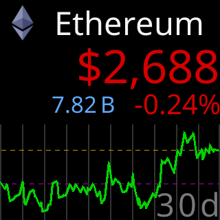
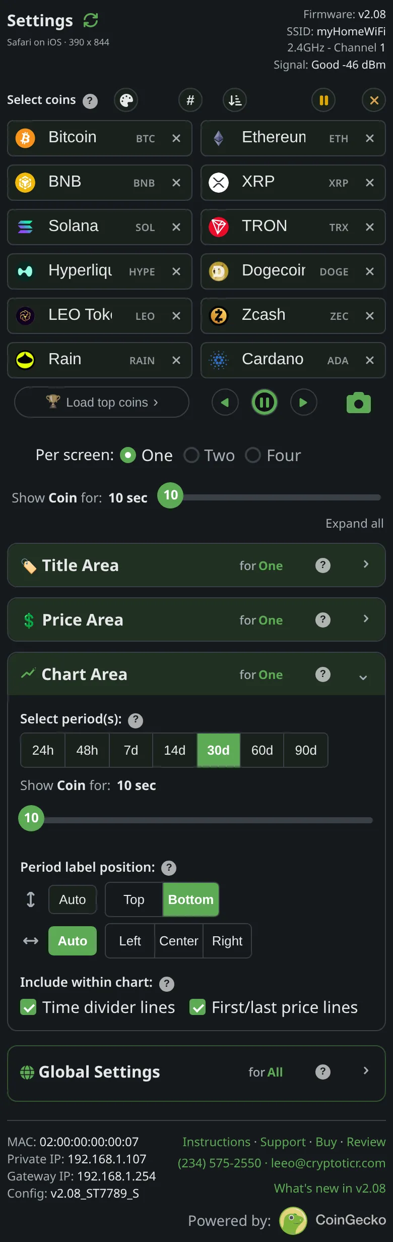
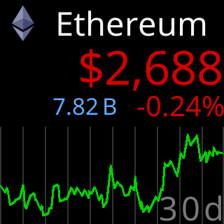
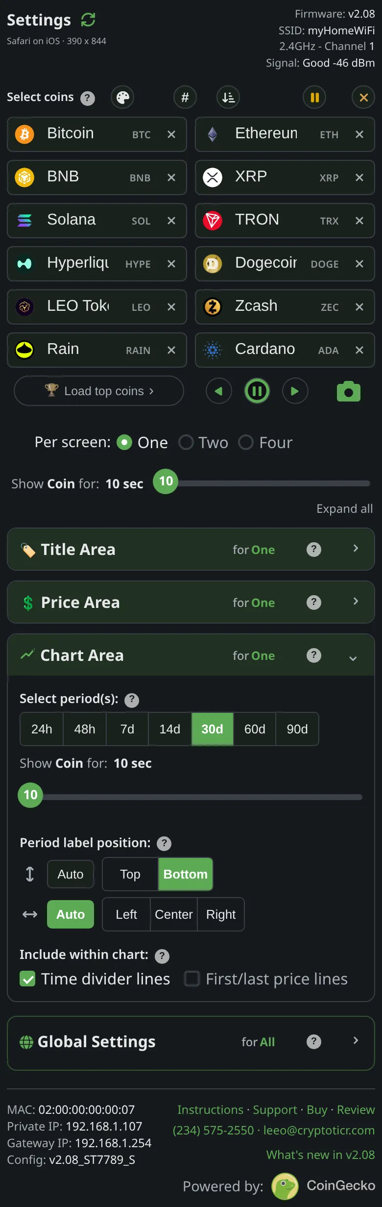
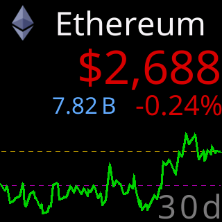
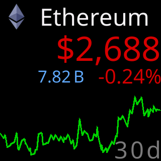
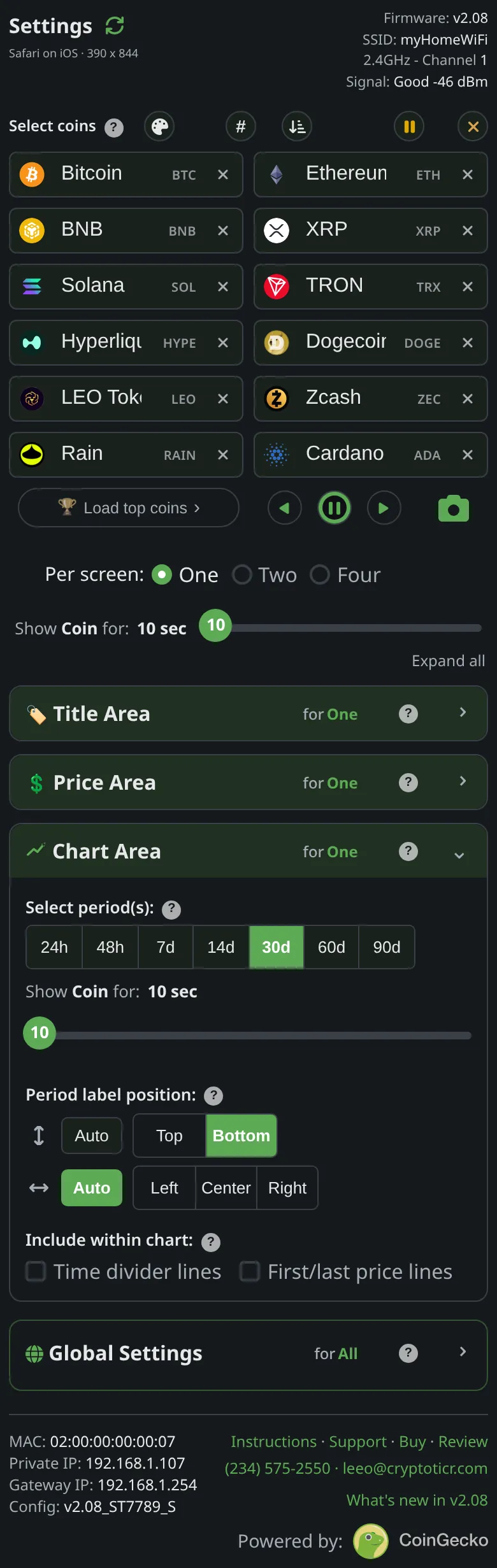
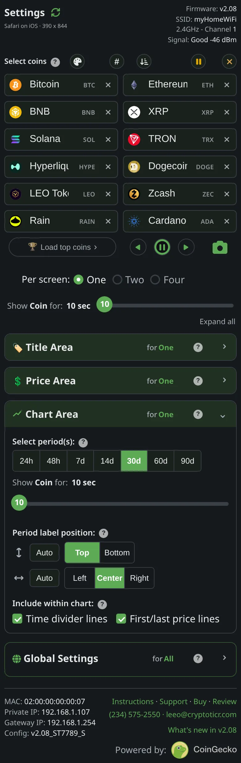
Time dividers split the period evenly; two dashed lines mark its first price and its latest. Either set can be turned off.
Period label
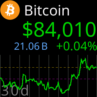
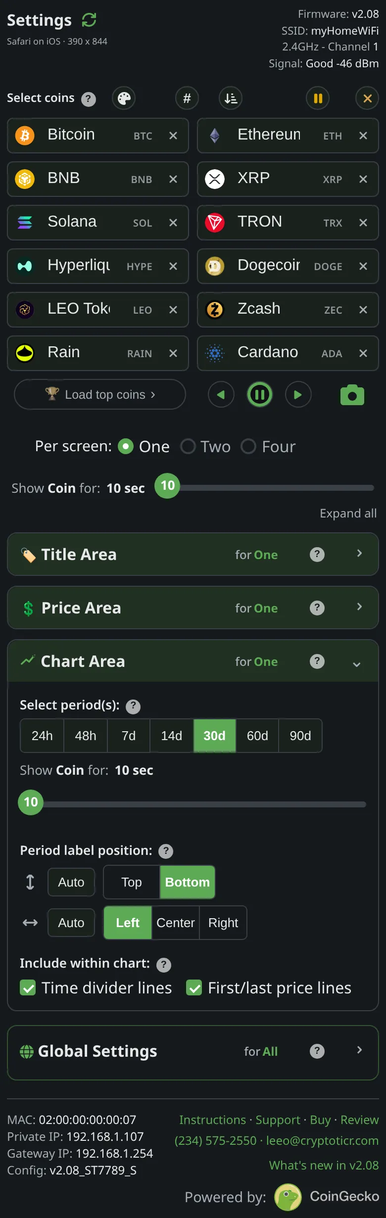
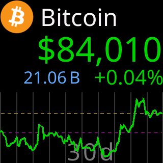
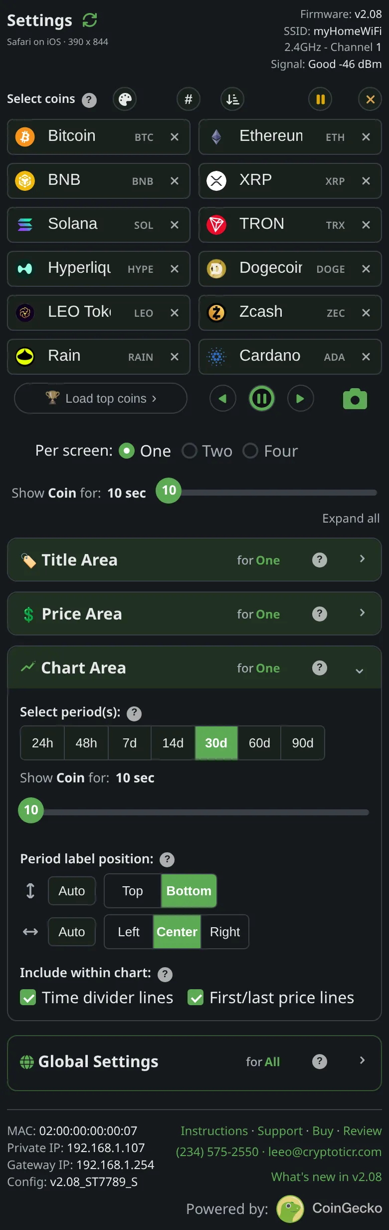
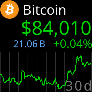
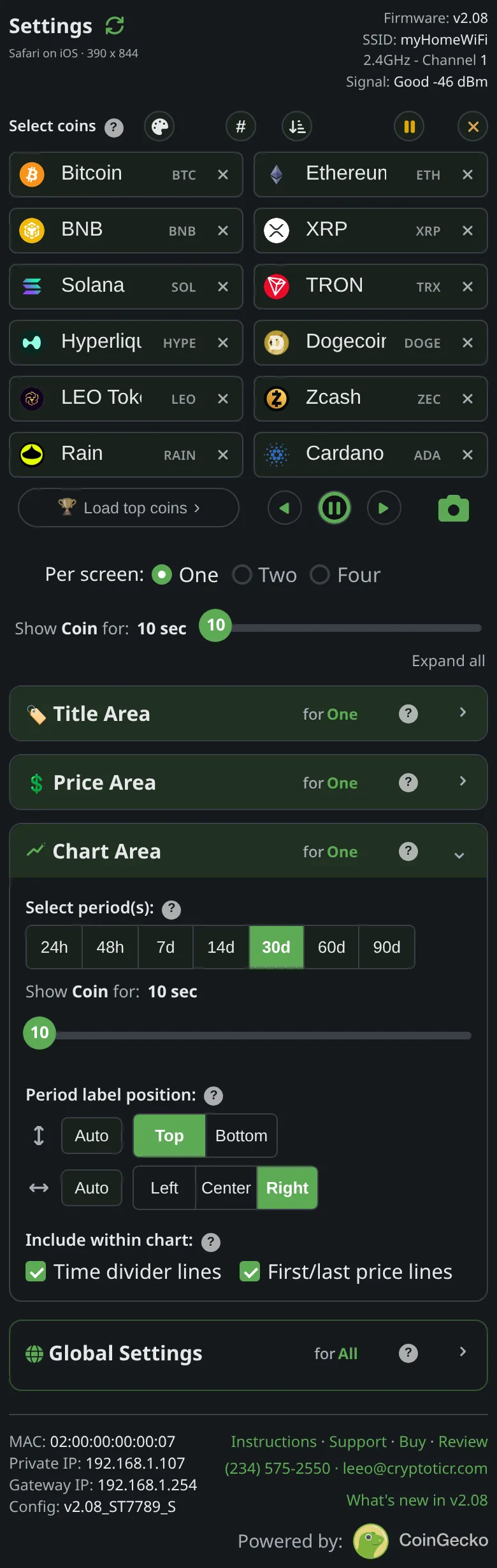
The chart names its range in a corner. Pin the row and the spot, or leave either on Auto and the ticker finds a clear place, chart by chart.
Give me the full detailsHide the details
Which chart periods can the ticker show?
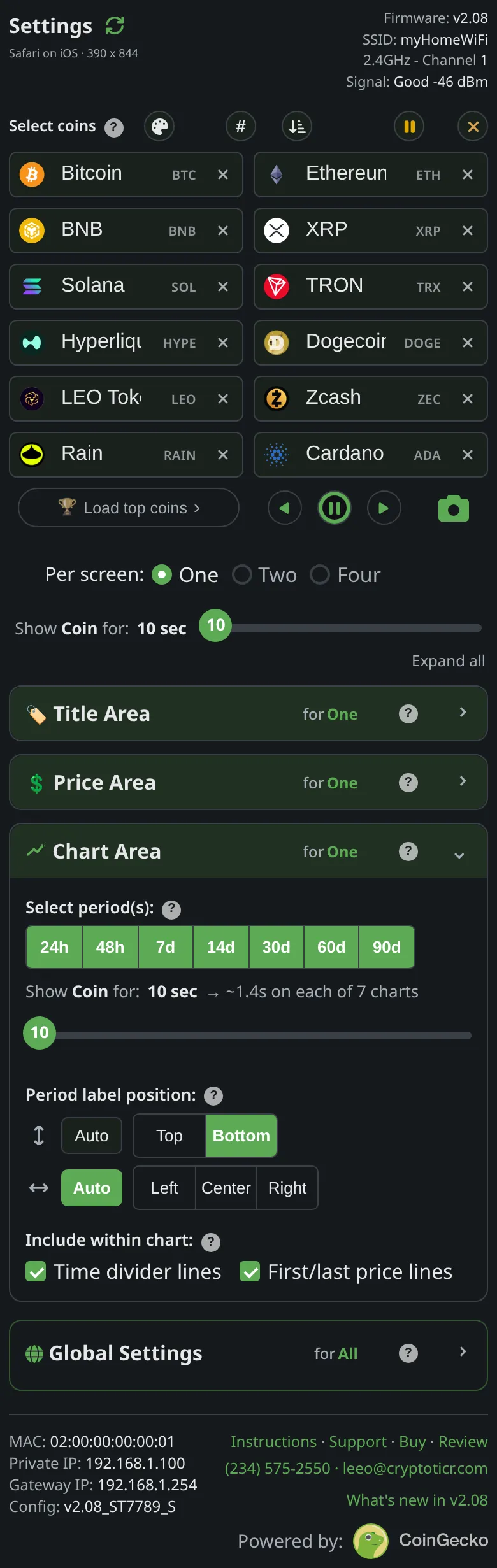
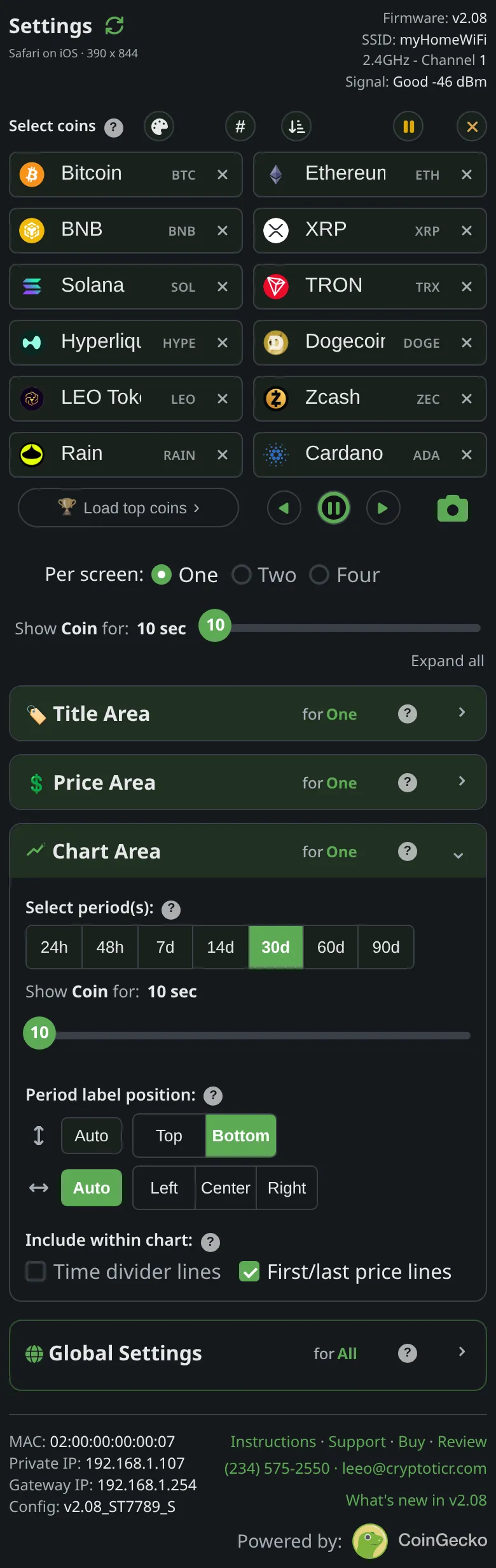
The ticker can show seven chart periods, all counting back from the moment the coin was fetched: 24 hours, 48 hours, 7 days, 14 days, 30 days, 60 days and 90 days. They are the buttons under Select period(s) in the Chart Area, labeled “24h”, “48h”, “7d”, “14d”, “30d”, “60d” and “90d”, and each chart names itself on the screen with the same label. From the factory the 24h and 90d charts are on. Charts exist only in One per screen; Two and Four per screen have no room for one (why).
What is a chart drawn from, and how often is it refreshed?
Each chart is CoinGecko's price history for its period, and it arrives with the price each time the coin's turn begins, so moving from one chart to the next during a stay fetches nothing. The right end of the line is the latest price at the moment of that fetch, the same figure printed above it. A coin younger than the period is charted over the history it has, so a month-old coin's 90d chart covers that month.
How is the line scaled to fit the chart?
The chart spaces time evenly from left to right: the oldest price of the period at the left edge, the latest at the right. Vertically, each chart is scaled to its own period: the period's highest and lowest prices fill most of the chart's height, with a little room above and below so the line stays clear of the edges. When a whole period barely moved, the line keeps to the middle of the chart, so a stablecoin's tiny wobble does not look like a storm.
No price scale is printed, so a chart shows the shape of the period rather than its size: a 2% week and a 20% week can fill the chart the same way. The 24h% is the number to read for size; on the chart, the dashed lines show where the period started and ended within its range. The line is drawn in the up color when its latest price ends higher on the chart than its first, the down color when it ends lower, and gray when both land on the same level (see up and down colors).
How far apart are the time dividers?
Time divider lines are eleven faint vertical lines, one at each edge and nine between, that cut every chart into ten equal slices of time, oldest on the left. Each slice is a tenth of the period:
| Period | Each of the ten slices covers |
|---|---|
| 24h | 2.4 hours (2 hours 24 minutes) |
| 48h | 4.8 hours (4 hours 48 minutes) |
| 7d | 16.8 hours (16 hours 48 minutes) |
| 14d | 1.4 days (33.6 hours) |
| 30d | 3 days |
| 60d | 6 days |
| 90d | 9 days |
The dividers are drawn in the colorset's divider color, dark gray in Default, and they double as the grid the period label's letters sit in. They are on from the factory; untick them under Include within chart for a bare line.
What do the two dashed lines mean?
First/last price lines are two dashed lines across the whole chart: one at the level where the line starts, the period's first price, and one at the level where it ends, the latest price. When the latest line sits above the first, the coin is up over the period; below it, the coin is down; the distance between them is the period's net move, measured against the period's own range. Each has its own color in the colorset, purple for the first price and gold for the latest in Default, so you can tell them apart where they cross the price line. The dashes are 5 pixels long with 5-pixel gaps. They are on from the factory, under Include within chart.
Where does the period label go?
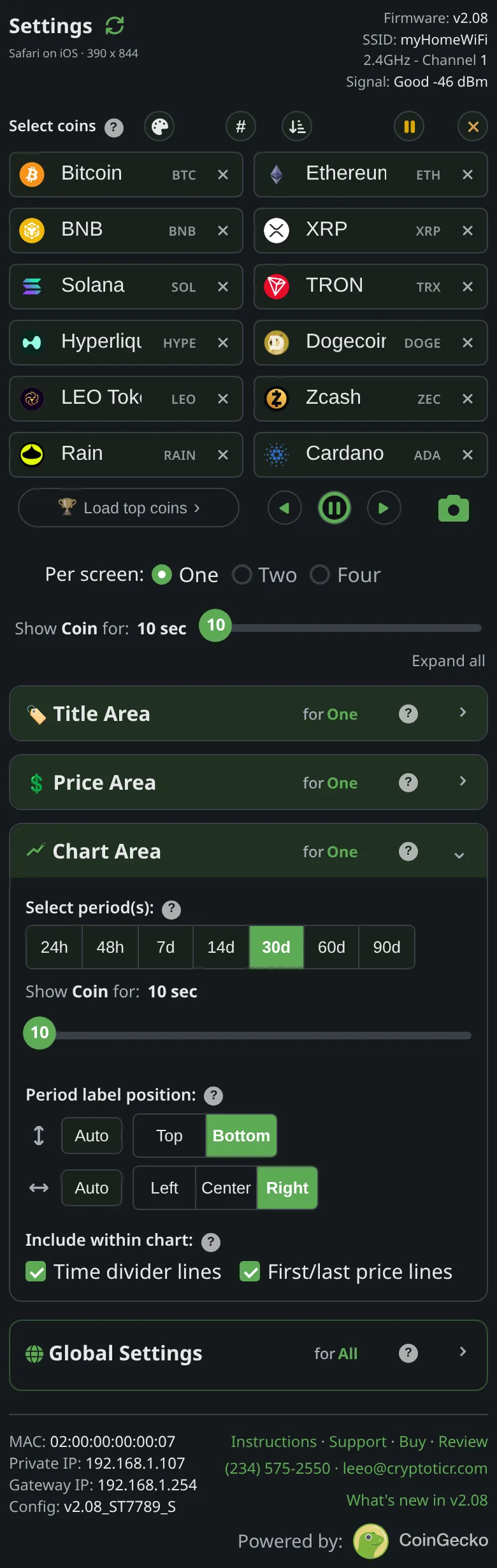
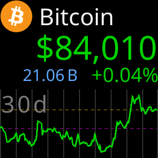
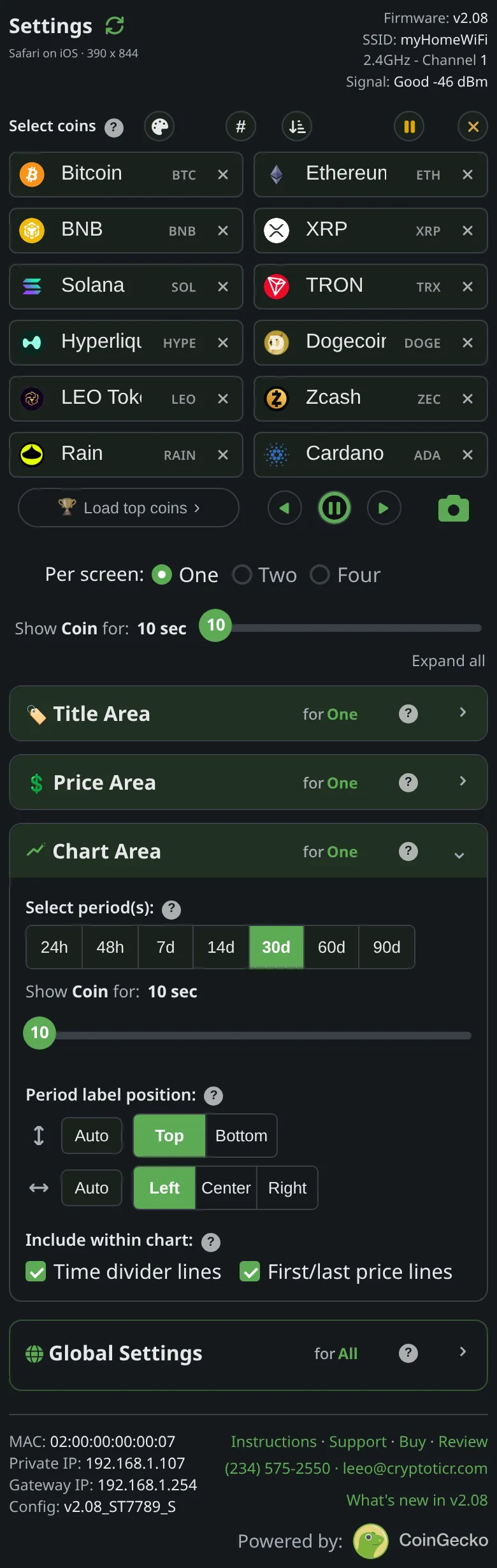
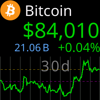
The period label (“24h”, “7d” and so on) is set in the largest text size, in the colorset's label color (mid gray in Default), with each character centered in its own time slice, so no letter ever sits on a divider. Period label position has two separate choices: the row (“Auto”, “Top” or “Bottom”) and the spot along it (“Auto”, “Left”, “Center” or “Right”). From the factory the row is pinned to Bottom and the spot is Auto.
- A spot counts as clear when at least 6 pixels separate the label from the price line, checked every 2 pixels across the label's width, and from the dashed lines when they are on.
- Spot on Auto: on the bottom row the ticker tries the right corner, then one slot in, then the left corner and one slot in, then the center and either side of it. On the top row it starts from the left corner instead. The first clear spot wins. Corners come first because a trending line leaves two opposite corners empty: a rising line clears the bottom right, a falling line the bottom left. A three-letter label cannot sit exactly in the middle of ten slices, so the center try weighs both near-center spots and takes the clearer.
- Row on Auto: the bottom row first, and the top row only when nothing on the bottom row is clear.
- A pinned spot keeps its corner and slides one slot sideways only when the line runs through it; with the row on Auto, it may also move up to the top row.
- When nothing allowed is clear, the label takes the allowed spot with the most room. It never leaves the rows you allowed, and it has no off switch.
What happens when several periods are selected?
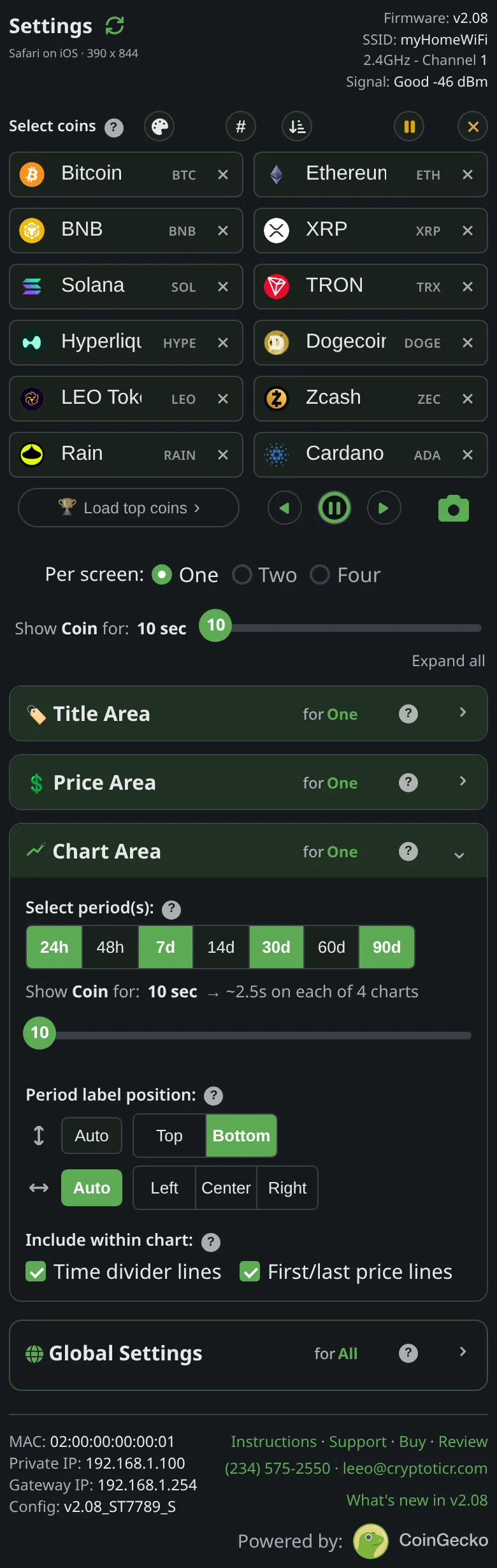
With several periods selected, the coin plays their charts one after another, shortest first: 24h, 48h, 7d, 14d, 30d, 60d, 90d, in that order whatever order you selected them in. The coin's Show Coin for time (10 to 30 seconds, in steps of 5) is split evenly, so each chart gets the stay divided by the number of charts. From the factory that is the 24h chart and then the 90d chart, each for half of 10 seconds. The title, price and figures stay put and only the chart area is redrawn, while the figures keep taking turns across the whole stay. After the last chart the next coin comes up. The Chart Area repeats the Show Coin for slider under the period buttons and prints each chart's share beside it, so if the charts flip by too fast, that is the place to give the coin more time. With all seven on and 10 seconds per coin, each chart gets about 1.4 seconds.
What shows in the chart area with no period selected?
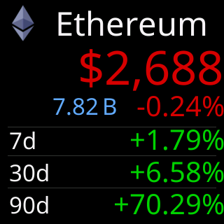
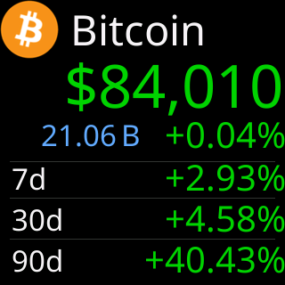
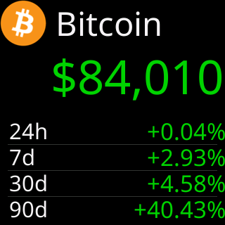
With every period unticked, the chart area becomes a small table of changes: one row each for 7d, 30d and 90d, with the label on the left and the change on the right, measured from the first price of that period to the latest price, with two decimals and a sign. When the Price Area shows no figures at all, a 24h row leads the table, since the 24h% is then nowhere else on the screen. Each change is colored by its own direction, gray when it rounds to 0.00%. A row whose history is not available shows “--” in dim gray, and thin lines in the divider color separate the rows. The coin stays on this one screen for its whole stay, and the settings page says as much beside the slider: “(no chart = show: 7/30/90d % change)”.
What does the chart show when a period has no data?
A chart with no data for its period keeps its frame and says so in the middle: “(No 24h Data)”, naming the period that is missing. The dividers and the dashed lines are still drawn if they are on, the dashed lines running flat through the middle, so the screen reads as a chart with nothing to show rather than a fault. When a coin's whole fetch fails, its charts are skipped for that turn and the chart area stays empty during the coin's short stay. See chart shows no data.
Up and down colors
Green for up, red for down
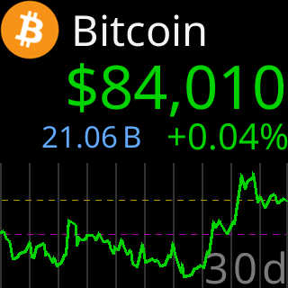
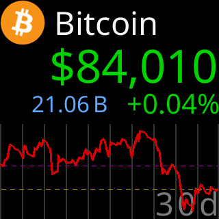
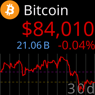
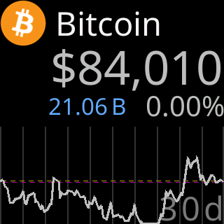
In the Default colorset a price in green rose over the last 24 hours and one in red fell; other colorsets use their own pair. A 30-day chart, five ways.
- The chart line follows its own period, so it can disagree with the price
- A change that rounds to 0.00% shows gray
- The gray is the same in every colorset

Give me the full detailsHide the details
What do green and red mean on the ticker?
In the Default colorset green means up and red means down, but the question each color answers depends on where it is. The big price and the 24h% are colored by the last 24 hours, rolling: up when the price is higher than 24 hours earlier, down when it is lower. The chart line is colored by its own period: up when the chart's latest price ends higher than its first price, down when it ends lower. Every colorset has its own pair for this job; Colorblind, for example, uses blue for up and yellow for down.
Why is the chart line a different color from the price?
The price and the chart line cover different stretches of time, so they can disagree. A coin can fall over the last 24 hours and still be well above where it stood 30 days ago: the price is red and the 30d line is green. The tiles above show all four combinations on a 30d chart. With several periods selected, the line can change color from one chart to the next while the price keeps its color for the whole stay. Even a 24h chart can differ from the 24h% on a nearly flat day, because the line compares its own first and last points at the chart's resolution, while the percentage is rounded to two decimals.
When does a change show gray instead?
A change that rounds to zero at the precision the screen prints is neither up nor down, so it is drawn in a neutral light gray. For the figures printed with two decimals (the 24h%, the price colored by it, and the change table shown when no chart period is selected) the rule is exact: a change smaller than 0.005% either way prints as 0.00%, carries no plus or minus sign, and is gray; at 0.005% or more it takes the up or down color. The color and the digits come from the same rounding, so the screen never shows “0.00%” in green. For the chart line, gray means the line ends at the same height it started.
The price is gray too when CoinGecko has no 24h figure for the coin at all. The 24h% then reads “-.--%”, because no figure is not the same as no change, and gray is the one color that claims no direction.
Why is the gray the same in every colorset?
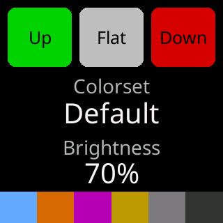
Up and down are signals and flat is the absence of one, so flat has to mean the same thing in all ten colorsets. That makes it the one color on the screen no colorset changes: a light gray, 190 each of red, green and blue. It is not yellow, because yellow already carries meaning in some sets: it is the down color in Colorblind and the up color in Amber, and Toxic draws its titles in it. It is not a dark gray either, because the darker grays already mean missing data, the “--” shown where a figure is not available, and a flat coin is not a missing one. No colorset uses gray for up or down, so the gray cannot be mistaken for a direction. The colorset card, which the ticker shows as it starts and whenever you pick a colorset, has three blocks, “Up”, “Flat” and “Down”, and only the Up and Down blocks change color from set to set.
Which parts of the screen take the up and down colors?
Four parts of the screen follow a direction: the big price and the 24h% (the last 24 hours), the chart line (its own period), and the change rows that replace the chart when no period is selected (each row its own period). Everything else keeps a fixed color from the colorset: the title, the three figures 24h Vol, Market Cap and Market Cap Rank (which you can recolor), the first-price and latest-price dashed lines, the time dividers and the period label. The colorset card lists those fixed colors in a band along its bottom edge: volume, market cap, first price line, latest price line, period label and dividers. The Market Info cards shown between coins use the same up and down pair for their 24-hour changes (Market Info).
Can I change the up and down colors?
The up and down colors change only when you choose another colorset. The pair comes with the colorset, and the ten sets are picked under Colorset in the Display section of the settings page (Colorset). The choice applies to every layout and shows on the ticker as soon as you tap it. The 24h% and the chart line cannot be recolored on their own, since their color is their direction, and the flat gray is fixed. The three figures in the Price Area can be recolored, per colorset (Price Area).
Full or minimal
The same coin, fully loaded or stripped back
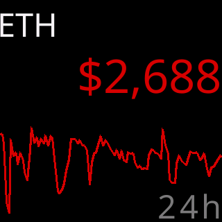
The first screen is the ticker as it ships, showing everything it can. The second has every extra switched off: only the symbol, the price and the chart line are left.
Give me the full detailsHide the details
What does the one-coin screen show with the factory settings?
From the factory, One per screen shows as much as fits on the screen:
- Title Area: the coin's icon and its name.
- Price Area: the price, colored by its 24-hour direction, with the 24h% at the right end of the row beneath it and 24h Vol and Market Cap taking turns on the left, each for half the stay. Market Cap Rank is off, and so is the V/M prefix in the Default colorset.
- Chart Area: a 24h chart, then a 90d chart, each for half the stay, with the time dividers and the first and latest price lines drawn, and the period label on the bottom row in whichever spot is clear.
- Show Coin for: 10 seconds per coin.
- Colorset: Default, green for up and red for down.
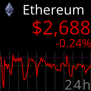

The first picture above is one moment of that screen: the 24h chart, during the volume's turn.
What happens during one stay of the factory screen?
With the factory settings, each coin appears with its icon, name, price, 24h Vol and 24h% over its 24h chart. Halfway through the stay two things change: Market Cap takes the volume's place, and the 90d chart replaces the 24h one, while the title, the price and the 24h% stay where they are. The figure's turn is timed from the start of the coin's turn and the chart's from the moment the first screen finished drawing, so the figure changes a moment before the chart. At the end of the stay the next coin comes up and the pattern starts again.
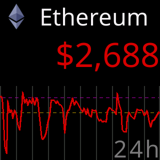
What does the “Bare essentials” screen turn off?

The “Bare essentials” screen, the second picture, is the sparest the settings allow, and it takes four changes: Symbol only in the Title Area, all four boxes in the Price Area unticked, a single period under Select period(s) (the tile uses 24h), and both boxes under Include within chart unticked. What is left is the symbol, the price and a bare line with its period label. With the Price Area empty, the ticker moves the price down a little for more air under the title, and the chart grows into the rest of the height.
Two things stay whatever you turn off. The period label has no off switch. And the price keeps its color, so even with the 24h% gone the price still says which way the last 24 hours went, while the line says the same about its own period.
Why choose the factory settings?
The factory settings give the most information per glance. In one stay you see which coin it is by logo and name, its price, its 24-hour move as a number, how much of it was traded and how big it is, and two pictures of where the price has been, one day and three months, with the dashed lines marking where each period started and ended. The screen changes during the stay as the figures and the charts take turns, which rewards a ticker you look at often and from close by.
Why choose the minimal screen?
The minimal screen suits a ticker you read from across a room. A symbol is short, so it usually gets the largest title size; the price is the only number; and two colors carry the story, the price's for the last 24 hours and the line's for its period. With one period and no figures, nothing on the coin screen changes until the next coin comes up, which makes it calm to have in view all day.
Can I mix the two, or go back to the factory settings?
Every choice is independent, so any point between the two works: keep the icon and drop the figures, keep one figure beside a single long chart, or turn the lines back on. These choices are remembered for One per screen only, so Two and Four per screen keep their own, while the colorset applies to all three. To return to the factory settings, use “Factory defaults” under “Restore from” in the Device section of the settings page. It also puts your coins and colors back as the ticker shipped (restore factory defaults).
Also on the settings page
The rest of the settings
The Market Info cards between coins, the address card, brightness and quiet hours, and the ten colorsets are on the Global settings page. How long each coin stays, the progress bar, date and time, and what a touch does are in the settings reference.